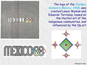
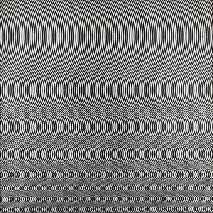
Walking into a room of Bridget Riley paintings during The Responsive Eye show at the Pasadena Art Museum was a very moving experience. Likewise, advertisements based on Op Art were dizzyingly distracting. The design from the 1968 Olympics was by Lance Wyman and based, in part, on optical art as well as indigenous Huichal. Wyman has referred to it as “60s op-art kinetic typography” (Walker Art Center).
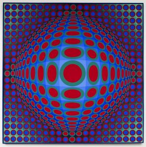
 And, of course, one of the founders of the movement, Victor Vasarely; beautiful color combinations in geometric settings. He studied at Műhely in Hungary; it could not offer the entire Bauhaus curriculum, so specialized in graphic art and typographic design. One of the earliest attributed Op Art pieces (1937) is Vasarely’s Zebras; the transition between realistic and Op Art is never very convincing to this writer and the connection between Op Art and more commercial design was not complete.

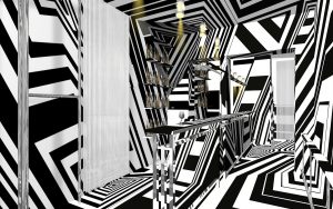
Op Art did pervade interior design, clothing, and advertising until with vibrating eyeballs we retreated. It was very high impact, but not maintainable.
References:
http://wwar.com/masters/movements/op_art.html
http://www.theartstory.org/movement-op-art.htm
http://blogs.walkerart.org/design/2014/02/10/insights-2014-design-lecture-series
http://www.walkerart.org/calendar/2014/insights-lance-wyman-new-york
http://www.lisicontemporaryart.com/vasarely-victor/


Hi Cheryl, I loved how you added in some optical-illusion art pieces to your post. Yes, though they are quite dizzying, I find them interesting and beautiful as well. I think that the first one on your post is the most beautiful, the thin lines slowly wavering gives the illusion of movement. Thanks for sharing! Bethany