Cheryl Morris

Jewelry, Gardening & Genealogy

  • Home
  • Genealogy
  • Art & Jewelry
  • Gardening
  • Writing
  • Travel
  • Weblog
  • Shop
  • Cart
  • Checkout
  • My account

What Learned?

Words presented in a more or less permanent media are what drives our culture and connects us to the recent past and propels us forward. When words are missing, as in prehistoric art, we are not sure of the meanings conveyed by images. We guess and maybe those guesses are correct; maybe not. Words help interpret societies that differ from ours or that have disappeared. We may not get all of the connotations but probably have better interpretations than we would with a non-literate society.


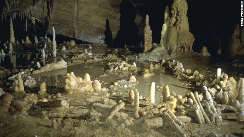
For example, stalagtite/stalagmite pieced circles in Bruniquel Cave in France have recently been dated to 175,000 years ago. Such work had to have religious or cultural meaning for those who built it, but what? We have no written or verbal records.

160526121742-neanderthal-cave-6-exlarge-169

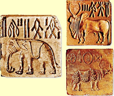
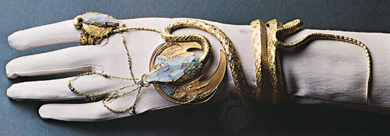
Even much later when there are written records, we may not be able to read them (Harappan and Etruscan). The Pyrgi Tablets, Etruscan gold leafs on the right, hold clues as two of the three are in the Etruscan language and the third is in Phoenecian.

display-2974  EtruscanLanguage2

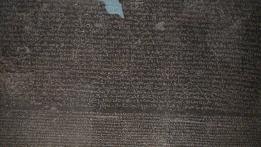
Being able to read written records gives us a huge input to society. That is what the Rosetta Stone did for Egyptian culture and what code breakers have been able to do with other (ancient) languages.

RosettaStone-01104

With writing came records that are sometimes surprising. The angry cuneiform letter to a supplier about his inferior goods gives an insight into commercial dealings.

“You have put ingots which were not good before my messenger and said, ‘If you want to take them, take them. If you do not want to take them, go away’. What do you take me for that you treat … me with such contempt? I have sent as messengers gentlemen, like ourselves, to collect the bag with my money (deposited with you), but you have treated me with contempt by sending them back to me empty-handed several times, and that through enemy territory.

… You alone treat my messenger with contempt! …

You have withheld my money bag from me in enemy territory; it is now up to you to restore my money to me in full.” (Oldest Known Complaint Letter)

r1402300_20023362

The Incan quipu, very obscure, helped with inventories even though it is knotted, not written, but could not related stories.

Inca_Quipu

And least likely to have survived, early London records on wood; the earliest dating from 57AD, give some life to early London; those wood fragments were preserved by lying in mud. Originally covered with wax, which has disappeared, the stylus marks made in the wax are, in some cases, readable.

4000A tablet dated AD 80-90/5, which translated reads: “You will give [this] to Junius the cooper, opposite [the house of] Catullus”. Photograph: Daniel Leal-Olivas/AFP/Getty Images from The Guardian.

Oral tradition required exact replication for a message to be understood over generations. It could convey the emotional subtleties not possible in print. With print, it is easier to have “exactness” of words over centuries but the inflection of the oral tradition is lost. There is another path: the video where verbal stories/information can be enhanced by motion. This probably comes closest to showing what is intended.


References:

http://www.cnn.com/2016/05/26/europe/france-neanderthal-cave-circles/

http://www.e-archeos.com/articoli/the-etruscan-language-riddle.html
https://en.wikipedia.org/wiki/Pyrgi_Tablets
https://partnersindesign.wordpress.com/tag/villa-guilia/

http://www.ancientscripts.com/indus.html
http://www.ancientscripts.com/quipu.html

http://www.theguardian.com/uk-news/2016/jun/01/tablets-unearthed-city-glimpse-roman-london-bloomberg
http://www.ancient.eu/Indus_Script/
http://www.abc.net.au/science/articles/2015/03/24/4200708.htm

Design Goes Digital

How can we understand how much computers have changed our lives just within two generations? Travel back to the 1950s and there were computers. Giants in cavernous, cooled rooms usually with repair people lurking about. There was no monitor, but there were flashing lights and the machine was slow enough that you could tell if the program was looping. Programming required punching IBM cards or Teletype tape and then feeding it into the machine.


IBM 7090 (3)

By the late 1960s, there was at least one embryonic LAN connecting a mainframe (IBM7090) and digitized scanning stations in the same room as well as down the hall. It was only later that I learned the importance of this unusual set up (in the Physics Department, UCLA). During the 1970s, progress was made with faster computers, but they still were rare and expensive. What were we doing? Looking on 72mm film for interesting basic particle interactions and doing a 3-view digitization of the reactions.

The 1980s showed a huge flourish in smaller computers. It was in the early 1980s when lines CP/M flourished and there was a computer, Kaypro, for writers.

kayproii

It did have software: WordStar and a very primitive spreadsheet and database. CP/M had severe limitations just from the chip set, so it was quickly surpassed. From the mid-1980s, the computers from Apple showed how they could be used in design. Microsoft also began shipping operating systems that had graphical capabilities with Windows95. With Windows 95, it was possible to log onto the Web.

We knew of ARPANET but it was not available to most. Online resources were limited to text only services like Compuserve. By the mid-1990s, this changed. I was working for an ISP and remember vividly the chaos caused by the release of Windows 95; everyone wanted online. We were creating Web sites; hand coding was the norm (don’t ask about the blink feature). Login was erratic and the speeds were slow, but we were on the Web!

Designers wondered why some features did not work; there was a real difference in the capabilities of Netscape when compared to Internet Explorer. A site designed and coded for one browser might not work as intended with another one. One of the first challenges was for browser creators and designers to use standardized tags. Next, what fonts to use? Not all were rendered properly. Colors? Only if Web safe. Images? Yes, but watch the pixels.

Grapus

Who were they?

Grapus was a group of designers led by Pierre Bernard and founded in 1970 in France; it lasted until 1999. Grapus was founded after the student strikes in Paris in the late 1960s and adhered to culture and politics and scorned advertising. All works were signed Grapus. Their political views were communist and each was a party member.

Grapus “often used bright colors, sensual forms, handwritten text, high-spirited visual pranks, and also very extensive symbolic vocabulary. The technique they used was known as detournement, which is the rerouting of a message through acts of visual vandalism” (Wikipedia). In an interview in Eye Magazine, Bernard credits the Push Pin Studio with the “notion of the relationship between the image and typography” and their sense of calligraphy came from Poland.

Grapus_Mickey

Right! (I don’t like Mickey Mouse) From 1981, and part of a series for an exhibition of posters at the Louvre, the image is likely a response to Disney’s plan to open a theme park in Europe. The exact location was not decided until the mid-1980s, so it seems Grapus’s response here was to the overall plan and Disney in general.

Grapus_bombs

Part of a series of posters regarding US war in Vietnam in 1970. The 10-part series varied in color but the images remained the same.

LaTraviata

Part of a series of posters for Opera in the City. The image is bewildering, as I cannot relate it to any part of Traviata. To Grapus, what made good design visuals was the strong conflict between form and content. Considering this, is the visual comment on the severing of her palm lifeline what the image depicts? It is not on suicide, as Traviata died from consumption.


References:

https://en.wikipedia.org/wiki/Grapus

https://baylizgrace.wordpress.com/2014/04/06/pierre-bernard-and-the-grapus-collective/

http://theredlist.com/wiki-2-343-917-1000-view-logo-visual-identity-profile-grapus-studio-of-graphic-creation.html

http://www.sitographics.it/imagini_grapus.html

http://digilander.libero.it/sitographics/imagini_grapus.html
Poynor, Rick. “Reputations: Pierre Bernard.” Eye Magazine. Eye Magazine, n.d. Web. 3 Apr 2014. <http://www.eyemagazine.com/feature/article/reputations-pierre-bernard>.

Op Art & Advertising

Fall 1963 Bridget Riley born 1931 Purchased 1963 http://www.tate.org.uk/art/work/T00616

Fall 1963 Bridget Riley born 1931 Purchased 1963 http://www.tate.org.uk/art/work/T00616

Walking into a room of Bridget Riley paintings during The Responsive Eye show at the Pasadena Art Museum was a very moving experience. Likewise, advertisements based on Op Art were dizzyingly distracting. The design from the 1968 Olympics was by Lance Wyman and based, in part, on optical art as well as indigenous Huichal. Wyman has referred to it as “60s op-art kinetic typography” (Walker Art Center).

logoMexico1968And, of course, one of the founders of the movement, Victor Vasarely; beautiful color combinations in geometric settings. He studied at Műhely in Hungary; it could not offer the entire Bauhaus curriculum, so specialized in graphic art and typographic design. One of the earliest attributed Op Art pieces (1937) is Vasarely’s Zebras; the transition between realistic and Op Art is never very convincing to this writer and the connection between Op Art and more commercial design was not complete.
tumblr_ne4o4lOXaX1rlaql2o5_1280
Op Art did pervade interior design, clothing, and advertising until with vibrating eyeballs we retreated. It was very high impact, but not maintainable.

op-art-01


References:
http://wwar.com/masters/movements/op_art.html
http://www.theartstory.org/movement-op-art.htm
http://blogs.walkerart.org/design/2014/02/10/insights-2014-design-lecture-series
http://www.walkerart.org/calendar/2014/insights-lance-wyman-new-york

Vasarely, Victor

The Rise of Illustration & Herbert Bayer

If you have ever tried to write a description of how part A works/fits onto/in/with part B, you will likely be appreciative of illustration. Bayer was born in Germany and was attached to the Bauhaus movement until the beginning of World War II, when he escaped and eventually settled in the United States. Through his friendship with Robert O. Anderson, he helped develop the corporate art collection for ARCO (wikipedia) that encompassed 30,000 works until it was liquidated upon ARCO’s sale to British Petroleum. Bayer was also involved in the complex planning of the Aspen Institute.

One of his great masterworks was The World Geo-Graphical Atlas which was funded by CCA (Container Corporation of America). Not content to build upon what was already available and just an update, Bayer immersed himself in study and travel. This work enabled him and his team of designers to envision and design a totally new approach to cartography that included “the color theories of of Egbert Jacobsen, the statistical representations of Otto Neurath and the dynamic design of Moholy-Nagy” (Codex99). Here is the page on soil types. It was totally Bauhaus in its ideal of complete design; the unity of art, craft, and technology.

CCA_Atlas_SoilTypesSoil types from the Atlas.

References:

https://library.rit.edu/gda/designers/herbert-bayer
http://bauhaus-online.de/en/atlas/personen/herbert-bayer
http://www.moma.org/collection/artists/399?direction=fwd&locale=en&page=2
https://en.wikipedia.org/wiki/Herbert_Bayer
https://www.behance.net/gallery/4655755/Essay-on-the-work-and-life-of-Herbert-Bayer
http://www.codex99.com/design/the-world-geographical-atlas.html
http://www.codex99.com/design/images/cca/atlas_soil_lg.jpg


Galka Scheyer and Duchamp

As a young adult, I loved going to the Pasadena Art Museum (part of the Norton Simon since 1974) because of the Galka Scheyer collection of Der Blaue Reiter (1911 to 1914) and later, the Blue Four: Lyonel Feininger, Wassily Kandinsky, Paul Klee, and Alexej Jawlensky. There were other artists in her collection–all superbly selected. But then, she was a painter, art dealer/collector and one of the founders of the Blue Four. Some of the artists I loved – Franz Marc and Kandinsky; one puzzled me: Paul Klee. Franz Marc was killed in World War I; this is a sample of his style with Blue Horse I: https://commons.wikimedia.org/wiki/File:Marc,Franz–Blue_Horse_I-_Google_Art_Project.jpg

Paul Klee’s Noctural Festivity is reasonably typical of Klee’s work.

Some years later, The Pasadena Art Museum held the first retrospective of Marcel Duchamp’s work (1963). It was memorable. Duchamp was there and played chess with a nude Eve Babitz. A large collection of Duchamp’s works were on display. Nude Descending a Staircase, the Fountain, L.H.O.O.Q., the Large Glass. Memorable!

The Bride Stripped Bare by her Bachelors, Even (The Large Glass) was begun and worked on for some years (1915-1923) and after Duchamp’s death, it was repaired and then still later, the lower panel was reconstructed. If you look at the link above, you can see the Large Glass as I saw it with breakage. I’m not sure which I prefer; Duchamp did not replace the glass during his lifetime though he did place glass on either side of the broken panes. I believe the version I saw with its webs of cracked glass is preferable.

The upper part is the realm of the Bride and the lower, the Bachelors.


Perhaps his most confusing is Boîte-en-valise :

What is this? Three ready mades and reproductions of paintings. Duchamp explains: “It was a new form of expression for me. Instead of painting something the idea was to reproduce the paintings that I loved so much in miniature. I didn’t know how to do it. I thought of a book, but I didn’t like that idea. Then I thought of the idea of the box in which all my works would be mounted like a small museum, a portable museum, so to speak, and here it is in this valise.” (http://nga.gov.au/international/catalogue/Detail.cfm?IRN=64922). Quite thought provoking.

References:

https://en.wikipedia.org/wiki/Galka_Scheyer
http://articles.latimes.com/1994-11-13/entertainment/ca-61975_1_modern-art


Rene Lalique – Glass and Jewelry – Art Nouveau & Art Deco

Art Nouveau flourished from the late 1890s to World War I. While it was best known for works on paper, the style was not so limited. Elegant, sinuous, sensuous, and slightly scandalous, Art Nouveau took hold in Europe but always seems, to this writer, slightly Oriental in concept.

While one of my favorite artists, Rene Lalique (1860-1945), did not set or design type, he was influential in glass design and jewelry design. One should also mention the fabulous hood ornaments and perfume bottles designed by him. I’m going to stretch the definition of graphic design and show a couple of Lalique’s drawings that were made into fabulous pieces of jewelry. To enter a room filled with his creations, such as Lisbon’s the Museu Calouste Gulbenkian is to be transported to another time and a different aesthetic. It is one of the most memorable museum rooms I’ve encountered.

Drawing for the Peacock Corsage Element (http://www.jessewaugh.com/museum-of-pulchrism-blog/lalique-in-lisbon)
IMG_4764

Peacock Corsage Element in gold, enamel, opals, and diamonds

IMG_4765


The Dragonfly Lady Brooch from 1903 (https://en.wikipedia.org/wiki/Ren%C3%A9_Lalique#/media/File:Lalique_dragonfly.jpg)

SONY DSC


Rolls Royce Hood Ornament (https://en.wikipedia.org/wiki/Ren%C3%A9_Lalique#/media/File:1956_Rolls-Royce_Silver_Wraith_%27Perspex_Roof%27_motif_-Flickr-_exfordy.jpg)

800px-1956_Rolls-Royce_Silver_Wraith_'Perspex_Roof'_motif_-_Flickr_-_exfordy

In this case, the fabulous glass hood ornament is on a 1956 Rolls Royce Silver Wraith.

Mucha was also involved in jewelry design but not, it seems, the actual fabrication. Here is a piece designed by Alphonse Mucha and created by Georges Fouquet for Sarah Bernhart in 1901:

45311-004-EA2FFB00It was Georges Fouquet who brought Mucha’s designs to life. Fouquet had studied with his father, Alphonse, and upon his father’s retirement took over the jewelry design. Sometime between 1895 and 1900, Fouquet began his work with Mucha. In 1901, a gorgeous showroom, designed by Mucha opened. I suggest looking at the blog pictures https://babylonbaroque.wordpress.com/2010/12/01/fouquet-mucha-an-inspired-collaboration/ and, in particular, the front of the store and its amazing Art Nouveau interior.


References and Attributions:

By sprklg – http://www.flickr.com/photos/sparklig/6129761819/, CC BY-SA 2.0, https://commons.wikimedia.org/w/index.php?curid=17739622

http://www.flickr.com/photos/sparklig/6129761819/, CC BY-SA 2.0, https://commons.wikimedia.org/w/index.php?curid=17739622

Fouquet & Mucha, an inspired collaboration.

Images from Museu Calouste Gulbenkian.


Personal Photography and Post Cards

Did George Eastman realize what he did for us with the invention and release of the Kodak?  That cool little camera enabled many a family to retrieve pictures and ways of living that were not possible prior to photography. I am the custodian of family photos, snapshots,  and post cards  from the early 1900s to about 1960. The images here are from my personal collection.

This is one of the early snapshots, about 1906, taken in Williamson County, Texas, and probably during a Swedish Methodist Bible Camp. I don’t know who is in the picture but I love it.

teeter totter

It is all about hats! This is around 1908/1909 and, again, I cannot identify the people but that does not matter; the hats – including his – are a hit.

hats_1910-1912

This is from grandma’s Engagement Party at Katy Lake, Texas, about 1908/1909. Frank has his back to us; Lydia has the ring.

untitled-2-9


Delya_Clarence_Buffalo_1917_lowresClarenceDelya1915

This is my aunt and her father-in-law showing off the new furnace in Buffalo in 1917. Where else would you find a fabulous furnace family photo? To the right is an earlier, but more traditional, snapshot of my aunt and her husband.


This is the heading out of San Francisco Bay of the Great White Fleet 1907-1909 and was taken by a photographer, Ed Stein, on board one of the ships.

sharbor


Almost with the rise of personal photography came the post cards. Again, it was George Eastman who was the innovator. The first real photo post card dates from 1899, but with Eastman’s purchase of Velox Photo Paper with the pre-printed post card back, printed images became readily available by 1902 (http://www.metropostcard.com/metropchistory.html).


BeMyValentine_1902_sm

This Valentine is from 1902 and the one below from 1906. The Golden Age of Post Cards was from about 1900 to 1917. The best printers were in Germany and World War I ended their dominance and innovation. Until 1907, one side of the card was for the address and the other for imagery and message; the change of 1907 was to divide the address side so that address and message were together.

MyLovetoYou


References
http://siarchives.si.edu/history/exhibits/postcard/postcard-history
http://www.metropostcard.com/metropchistory.html
http://www.old-prague.com/history-of-postcards.php
http://www.nysl.nysed.gov/msscfa/qc16510ess.htm

The Brothers Grimm: Ancient Tales to Print

brothers Wilhelm (1786-1859) and Jacob (1785-1863) Grimm
Oral folk tales and stories are part of  human tradition. In the late 1700s and early 1800s, many of these stories began to find their way into print. Some history of this genre’s transmutation from oral to visual is documented here. The Grimm brothers were not the first to print previously orally transmitted stories, but were the most successful. Their first collection was readied for publication in 1809 but was lost after being sent to Brentano and never published during their lifetimes. In 1812, Grimms’ first edition was published; other editions were published nearly every decade to 1857 . As best I can determine, the first edition had no illustrations. By 1819, engraved illustrations for the frontispiece and title page were included and these were done by their younger brother, Ludwig Emil Grimm.grimm_1819


Even by the edition of 1857, there is a lack of illustration in the German edition. It is a foreboding book with small margins and text set in a variant of black letter. (This example from the digitized book at Google.) The sole illustration I found was the frontispiece. However, an English edition dated 1857  is profusely illustrated. I cannot reconcile the claim of illustrations to the German edition with the lack thereof in the digitized version. However, the difference might be explained by the edition; there were, per Wikipedia, “large” editions and “small” editions. The small editions were intended for children while the large editions were annotated, adult-oriented and scholarly. Considering the confusion and lack of information I found while researching, it would seem a good field for a professional study.

1857GrimmFrontice piece 1857Slowly, the collected stories were edited in such a manner as to be acceptable to children; violence was tamed, for example. Edition by edition, more illustrations added until by the 1860s, there was little that resembled the brothers’ original ethnographic work. What was the impact of the Grimm brothers? The total circulation of all editions of their stories is estimated at over 1 billion. The stories, individually, have been woven “into theatre, opera and ballet works, but also into radio, film, television and new media forms. Finally, the influence of their fairy tales may be seen in everyday life by themes and motifs, in press and in advertising as well as in simple artefacts.”

Resources:
Grimm Brothers’ Home Page: http://www.pitt.edu/~dash/grimm.html
Grimm 1812 edition of Kinder und Hausmachen, digitized. https://commons.wikimedia.org/wiki/Category:Kinder_und_Hausm%C3%A4rchen_%28Grimm%29_1812_I#/media/File:Kinder_und_Hausm%C3%A4rchen_%28Grimm%29_1812_I_p_001.jpg
The Frog King, an example of changes made:  http://www.pitt.edu/~dash/frogking.html
Kinder und hausmärchen: gesammelt durch die Brüder Grimm, Volumes 1-2: https://books.google.com/books?id=y9tLAAAAIAAJ&source=gbs_navlinks_s
English edition, 1857, https://archive.org/stream/householdstories01grim
Brothers Grimm: https://en.wikipedia.org/wiki/Brothers_Grimm
1863-… Impact: http://www.grimms.de/node/197

British Library Image Downloads

It will be weeks before the class studies this era but I could not resist this bicycle. And the British Museum has free downloads.

12458867945_58b0fe7d7f_o

  • 1
  • 2
  • Next Page »

Graphic Design

  • Graphic Design
  • Historical
  • Jewelry Design
  • Uncategorized